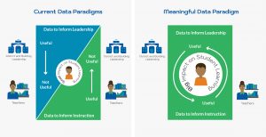
Data does not necessarily improve practice. It does not necessarily improve focus, communication, instruction, or other factors that lead to improved student learning. Meaningful data, that is, data that becomes information and leads to intelligent actions, can improve practice. Unfortunately, truly meaningful data can be hard to find.
The No Child Left Behind legislation introduced a new era of data in education. The Every Child Succeeds act amplified this focus on data. Today, the schools I work with focus more on data than I have seen in my three decades of working in education. Currently, much of the data targets leadership, which means, unfortunately, there is little that is helpful for teachers.
Data can only support teachers, rather than serve as a distraction, when it fulfills six key criteria. As districts work to improve the quality of the data they utilize to guide effective data practices, they should consider:
- Alignment: Is the data aligned with classroom instruction?
- Accessibility: Do the people who need the data have access to it?
- Detail: Is the data robust and specific enough to suggest actions?
- Timely: Is the data recent and can it be readily shared with stakeholders?
- Organized: Is the data consistent across classrooms and organized for easy use?
- Easy to understand: Is the data visualized in intelligible reports?
Alignment
Data needs to align with what is important and what is current. With the precious time teachers have for reflecting on assessment results and planning for how to respond, it is not helpful to have to consider things that are out of the current field of focus. For example, talking about students’ struggles with geometric figures in the midst of work with place value and addition and subtraction is not going to lead to meaningful actions. Therefore, the closer the data is to the lessons being taught, the better.
Alignment is one of the qualities of daily formative assessments that gives them so much power. An exit ticket, for example, should be related to what was the learning target of the day and is immediately useful for the following day’s lesson.
Accessibility
Data needs to be quickly and easily available to those who need it. This is especially true for schools where collaborative teams of teachers, specialists, and leaders all work together to support students.
If a teacher is keeping her assessment results in a spreadsheet locked down on her hard drive, that is probably helpful only for her. Imagine if this information is available to all relevant stakeholders. Yes, teachers need access to this data to plan and report to parents and others. But additionally, special education teachers and others who support students need easy access to this data to inform their planning and reporting. In turn, leaders need easily available data to inform their conversations with students, teachers, and parents. An informed leader is a more effective leader. Accessible data is critical for this.
Detail
State assessment results often tell us things like, “your students could improve in math.” This is almost meaningless. Meaningful information is detailed. As the data becomes more detailed and specific, it becomes increasingly valid and actionable. For example, it is more valuable to know a student is struggling with subtraction that requires regrouping than to know that a student is struggling with addition and subtraction under 100.
Having detailed data also means there is some redundancy in the data. That is, specific ideas are assessed more than once and in a variety of ways. This robustness makes data more detailed and reliable.
Timely
When data is timely, it is actionable. State assessment results arrive months after an assessment, sometimes after the students have left for summer vacation. This information serves purposes to understand student performance and monitor systemic growth, but it is not timely.
Timely data is collected on an ongoing basis and quickly digestible for teachers. This data serves teachers: it allows them and others who support students to quickly respond and improve instruction.
Organized
Shareable data is organized in the same manner. I remember clearly the day when I showed up to a meeting and asked about the results of a recent assessment a 4th grade team had done. One teacher showed up with her stack of assessments. She preferred a holistic perspective that considered all of the responses of the students in order to gauge their overall progress. Another teacher had her results in a paper grade book. She had loaded her book with + and - symbols to indicate which students acquired specific skills. The other had her computer open with a spreadsheet and had collected information on the percentage of problems the students had correct.
The problem? We had data, but each teacher had her own way of understanding the information. As a consequence, our conversation focused on what should be the focus of our conversation. We had to spend time understanding what each teacher's data was telling us about student learning in her classroom. By the time we had identified those areas of struggle for students, it was time for the teachers to return to their classrooms. No time remained for planning for how to respond, which is the most important part of any data conversation.
Organized data that is consistent across classes makes data conversations more efficient. When data is organized, conversations can quickly focus on actions teachers will take.
Easy to Understand
Looking at data can be overwhelming. We all have varying levels of data literacy and data visualizations can sometimes range from complex to downright confusing. For this reason, it is important that the presentation of data is quickly obvious to those analyzing it. The end goal is not to sit around for a whole meeting discussing what the data means; the goal is to figure out what to do with the information.
This need for intelligibility can place a heavy burden on teachers to organize their data. This process is tedious, time consuming, and error prone. Sometimes it requires them to sped precious time organizing data sets and building graphs. Some technology solutions require training to figure out what complex visualizations communicate or learn how to navigate through dozens of visualizations with multiple sets of drop-down filters.
Readily accessible and easy to understand visualizations efficiently transform data into action.
Conclusion
The current state of data-based decision making in education leaves a lot of room for improvement. Align data with classroom lessons. Make data accessible, not isolated in people’s desk drawers or hard drives, and provide enough detail for it to be actionable. Lastly, data needs to be timely so that it is relevant to teachers, and it must be organized and presented in clear, simple ways that are easy to interpret.
Interested in learning more about how Forefront provides an easy to use solution that makes it easy for your district to collect and visualize meaningful data? Check out our story or explore a demo.
About the author, David Woodward:
I came to math education in a rather round-about way. My undergrad studies were in German and music, and my masters degree is in bilingual education and ESL. I work as both a math instructional coach and founder and president of Forefront Education. Learn more about the company I founded and my background here.
About us and this blog
Our team and tools help schools implement standards-based grading, streamline assessment systems, and use meaningful data to drive decision-making.
More from our blog
See all posts


")

")
